


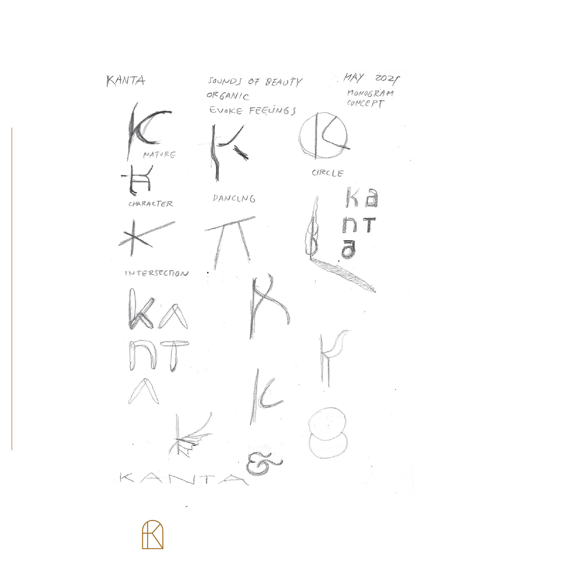
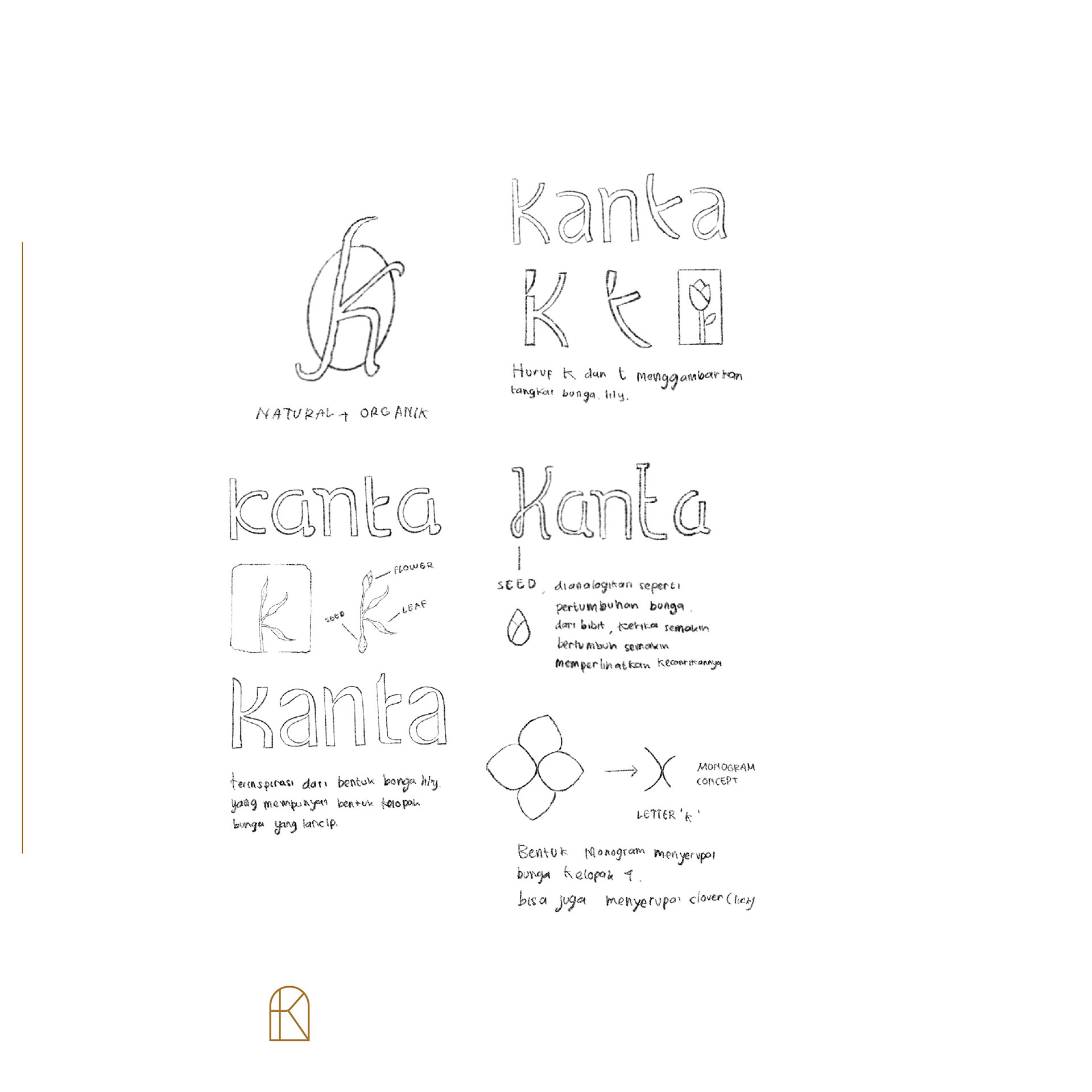
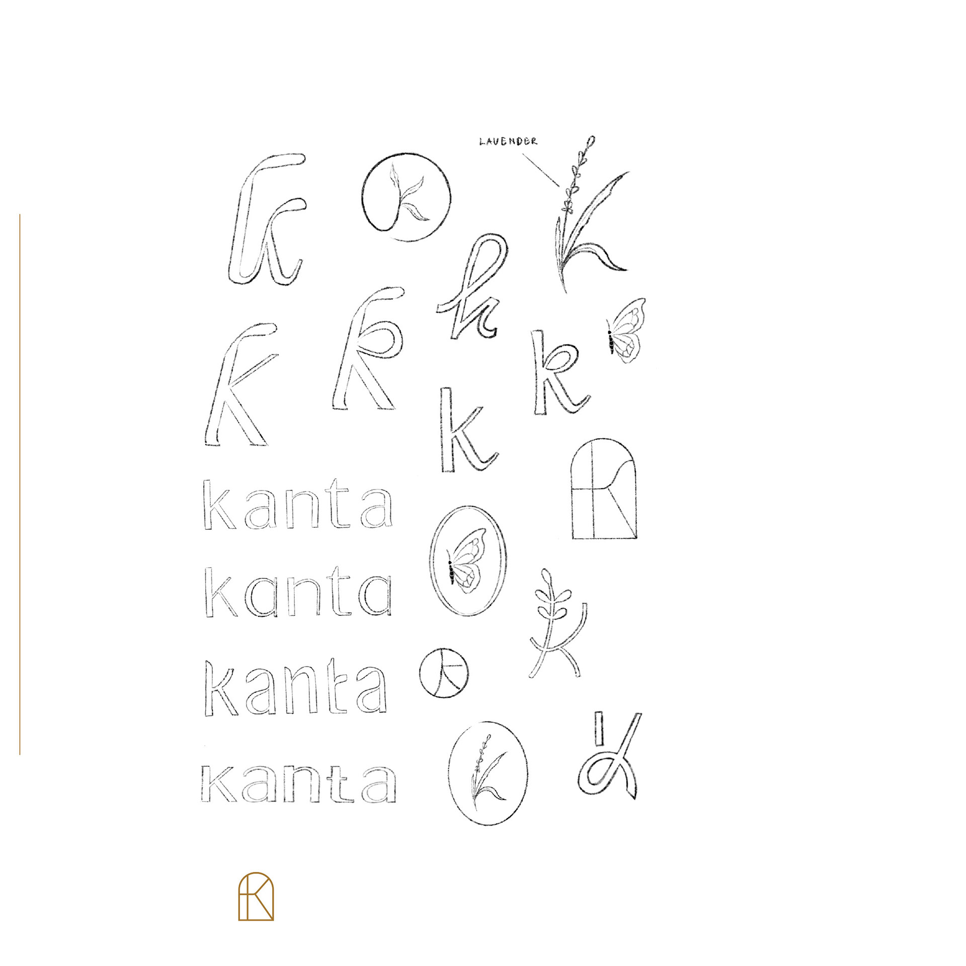
logo design sketching process
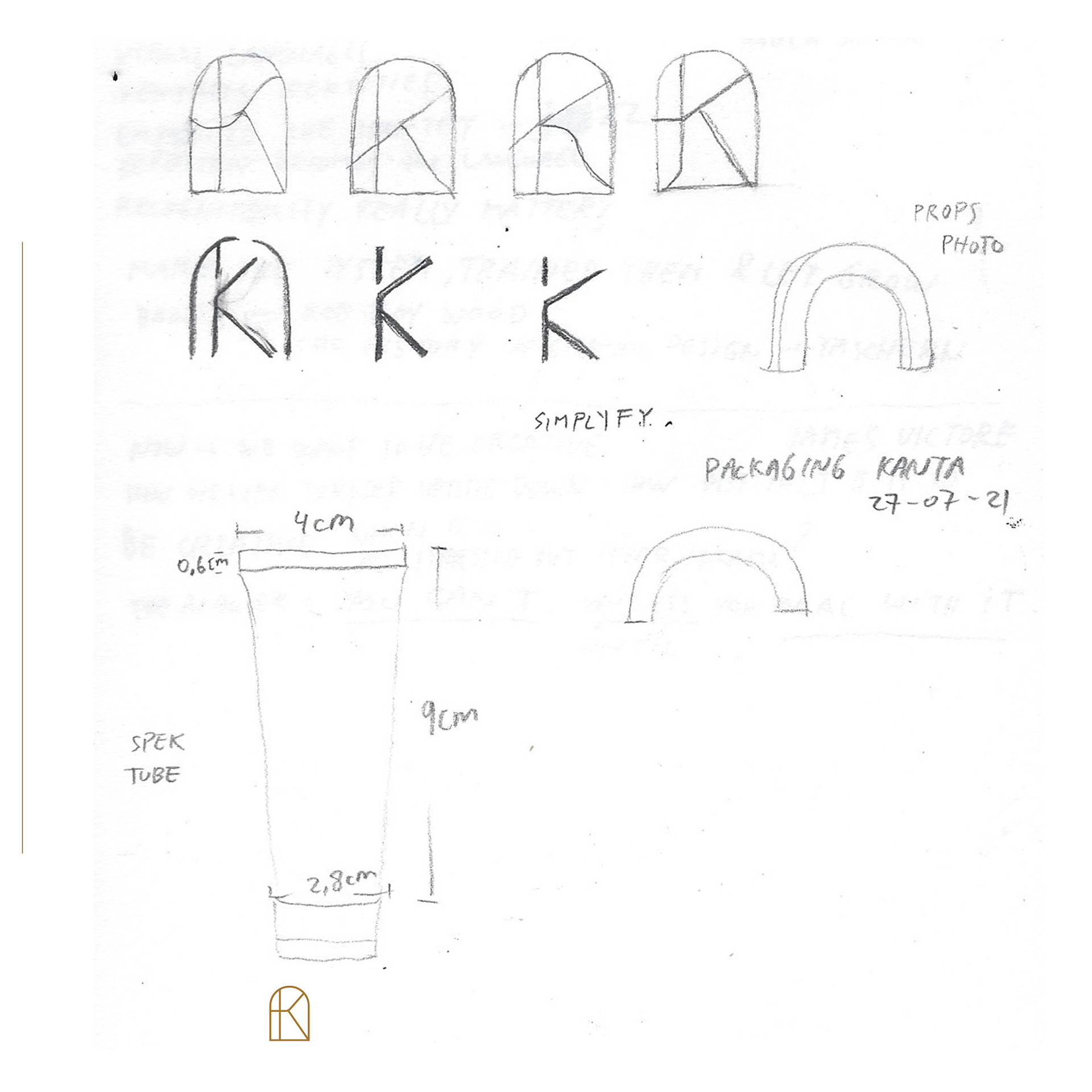
the evolution of the K logo symbol & the streamlined mineral graphic elements
DESIGN BRIEF
by recognising the uniqueness of kanta mineral
sunscreen has to offer for indonesian market,
we are striving to bring the product from brand identity
to marketing strategy.
OBJECTIVES
the word 'kanta' resonances beauty.
our design approach is based on
minimalism, breathing life
the word 'kanta' resonances beauty.
our design approach is based on
minimalism, breathing life
and clean design.
SCOPE OF PROJECT
identity design; label and packaging design;
brand guidelines;
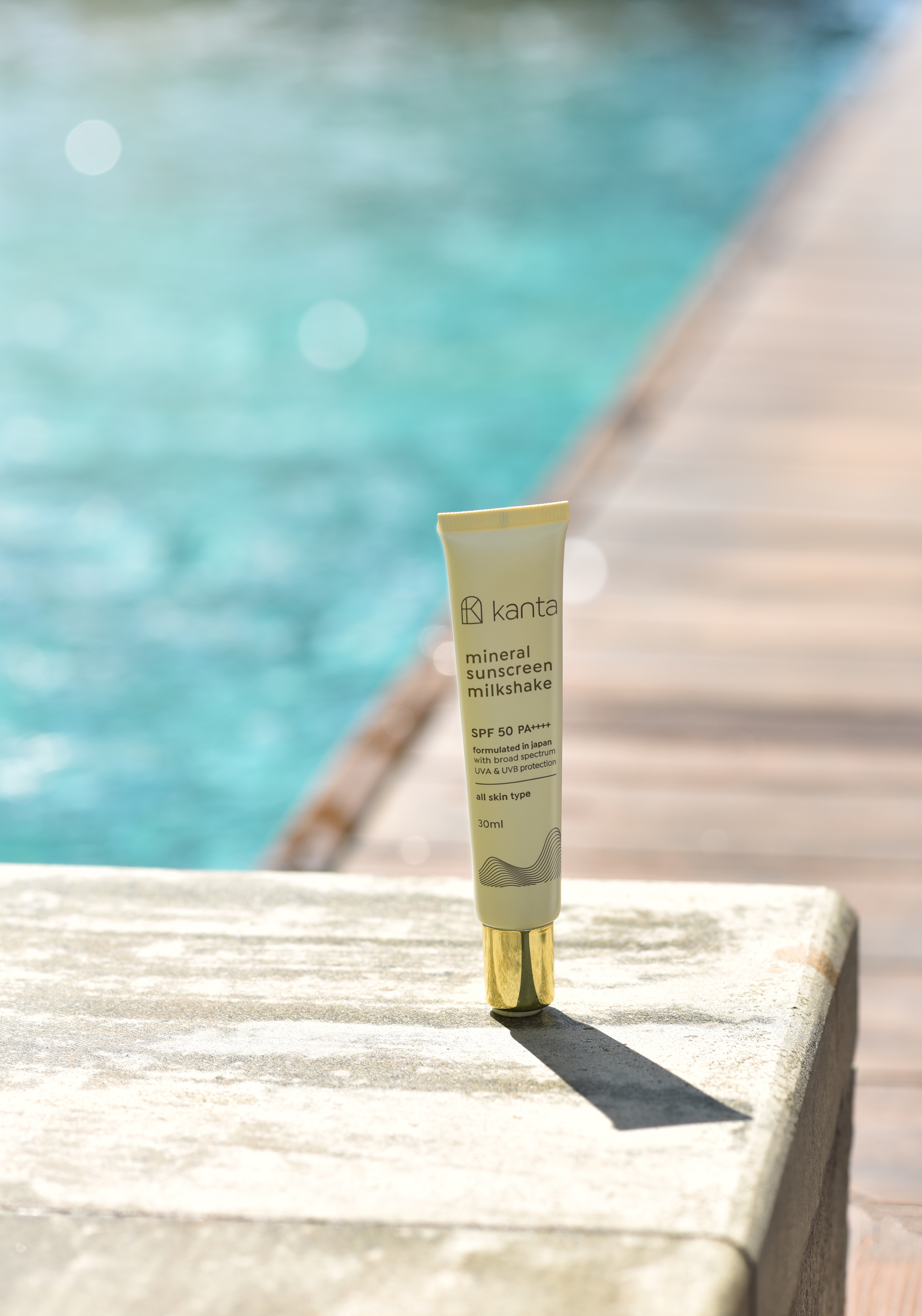
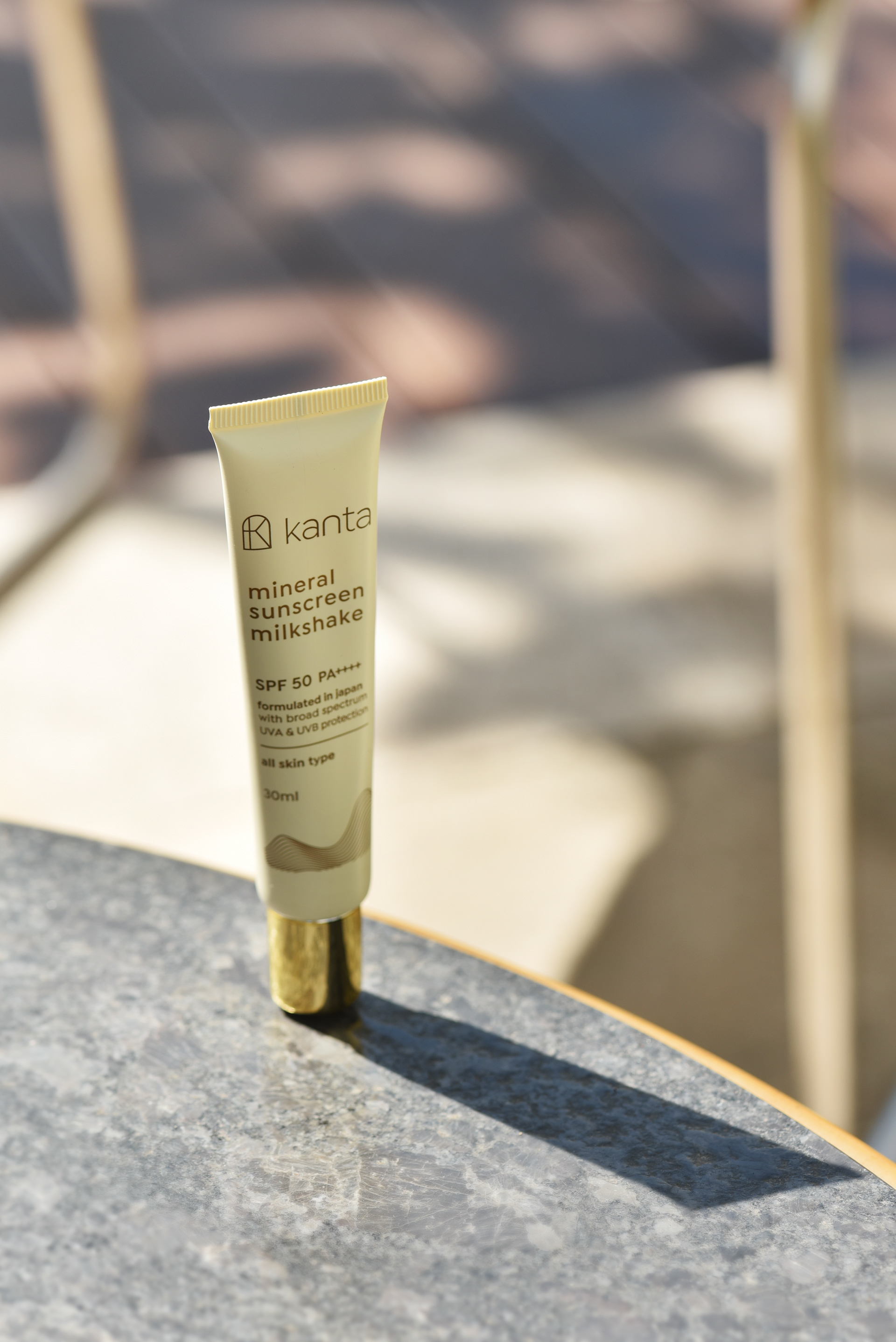
product photography
identity design; label and packaging design;
brand guidelines;
product photography
YEAR
2023
This project is featured in Design Rush in Best Designs of 2023. Please read more for details.
